We select, we combine, we choose

Contemporary Furniture

What do we consider when selecting our finishes and colors?

At Mobles 114, when it comes to our color palette, we always aim at selecting colors that merge together in our designs. We prefer subtle, calm tones that are not overly saturated and have a gentle brightness, ensuring a modern and timeless design that fits into any environment. These qualities prevent color fatigue in your home, contributing to the comfort that comes from enduring items, reflecting our commitment to sustainable design. This thoughtful color combination ensures our clients satisfaction with our designs over time, enhancing the well-being of their spaces.

Choosing Woods

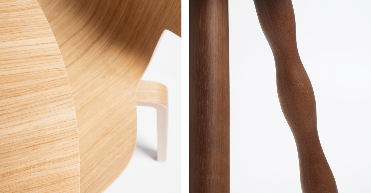
When it comes to woods, the situation is a bit different. Being natural materials, woods tend to complement each other. For instance, in a forest, various tree species coexist with diverse trunk and leaf shades while maintaining harmony. Nature does not require a choice.

However, in a forest, we don’t see the wood’s interior as we do in furniture. Just as different tree types can coexist harmoniously in a forest, various wood tones can blend naturally and unobtrusively in a home.

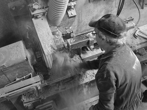
In our production, we use woods like oak, ash, walnut, and beech, always selecting the finest planks to ensure the highest quality. These woods allow us to create furniture for residential and office projects with a natural and elegant finish, providing a sense of balance and well-being, in line with the tradition of functional and elegant design.
Harmony in Design
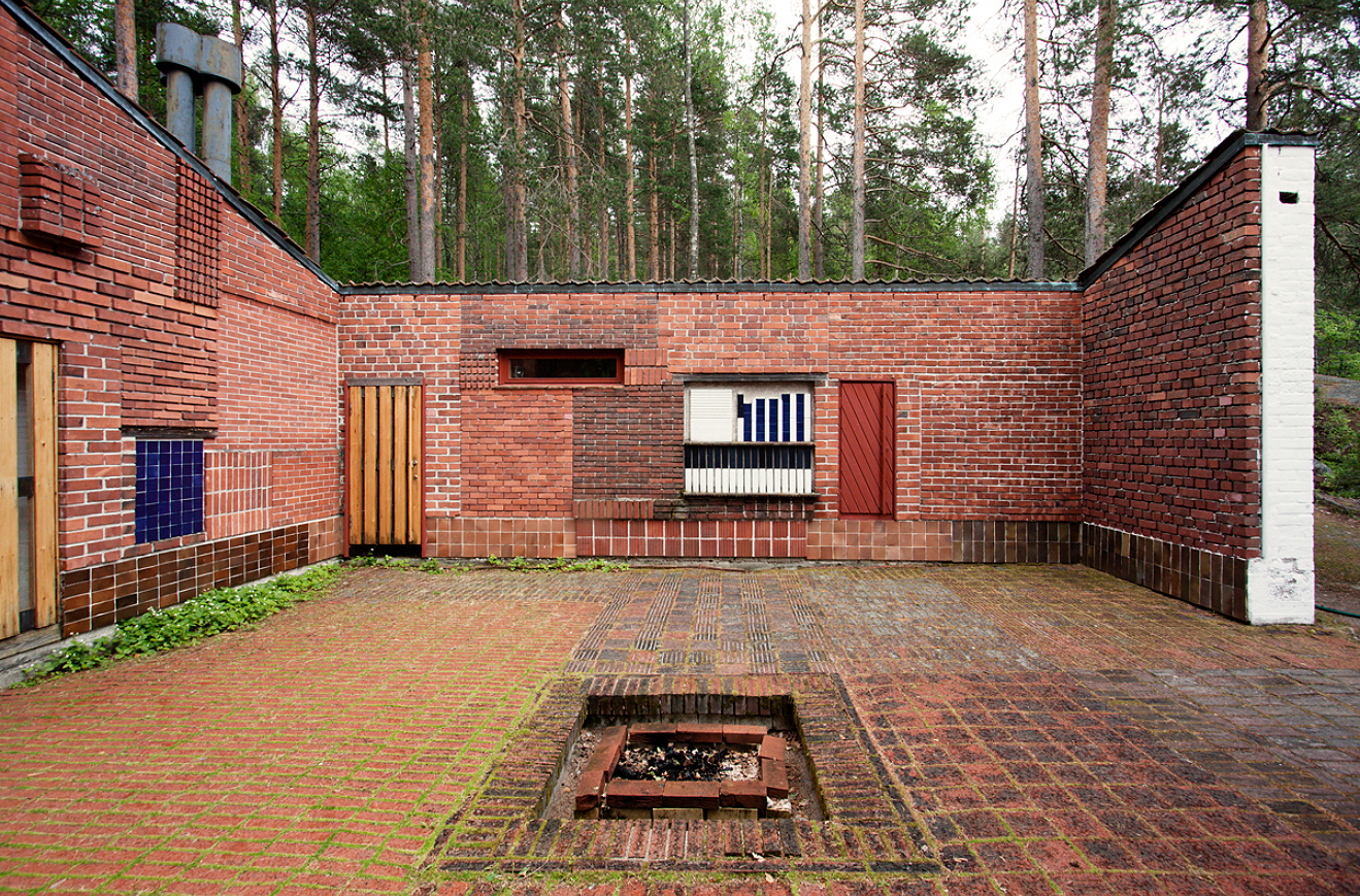
Muuratsalo. Alvar Aalto

Examples of Harmony in Design

A parallel may be drawn with the different bricks that make up the facade of Alvar Aalto’s Muuratsalo house. Although made from the same material, they come in different shades, creating, we believe, an undeniable harmony.

In our contemporary furniture we apply a similar principle: a careful combination of materials and tones to maintain balance in each piece.

Our Experience with Woods and Materials

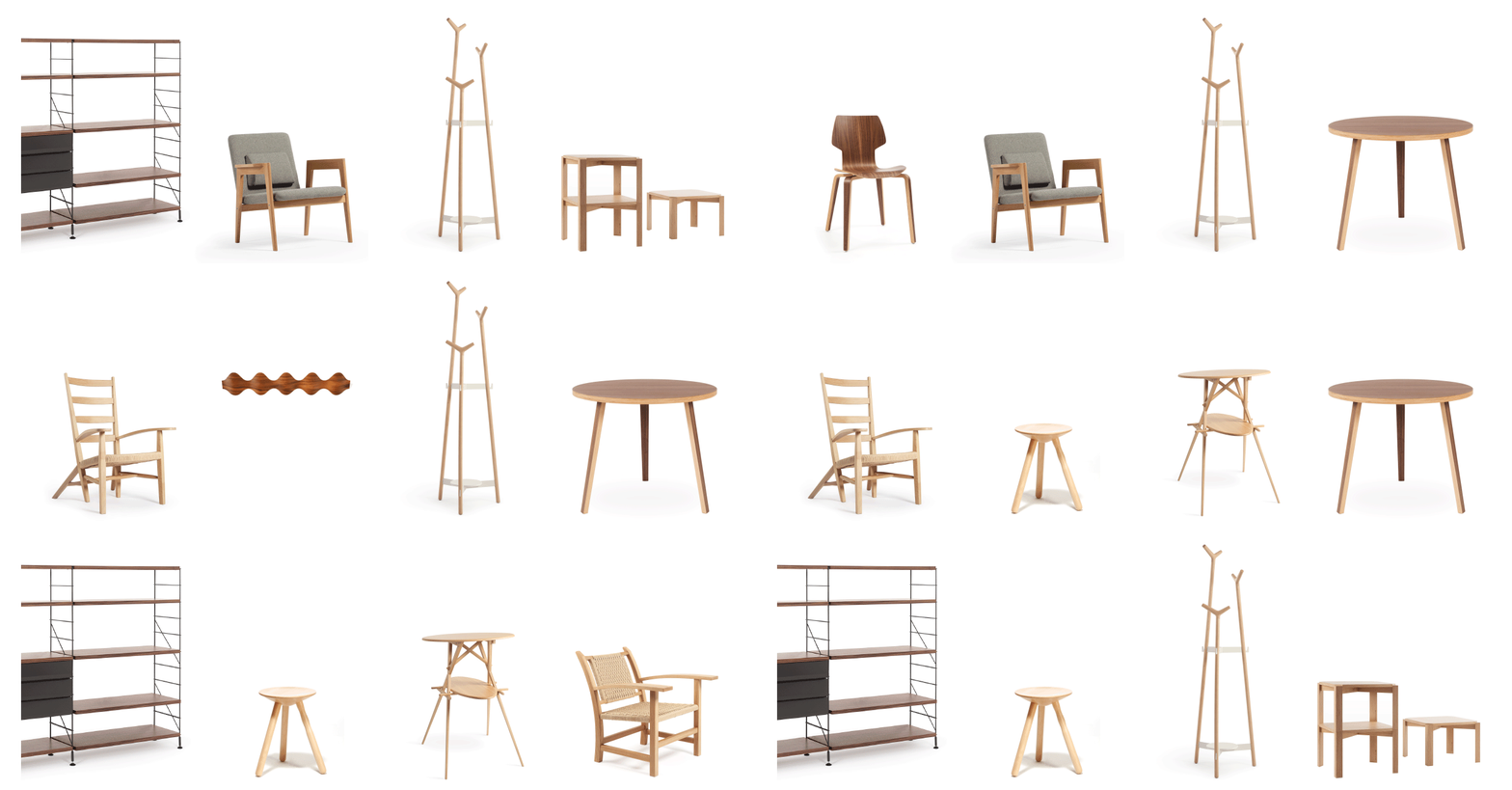
At Mobles 114, we have extensive experience working with a variety of woods: oak, beech, walnut, cedar, maple, bubinga, cherry, iroko, ash… We have produced chairs, coat racks, armchairs, tables, and shelves. We always select the best planks from each tree. We do the same when choosing veneers: we pick those with the best figure and tone, to offer you a collection of the highest quality.
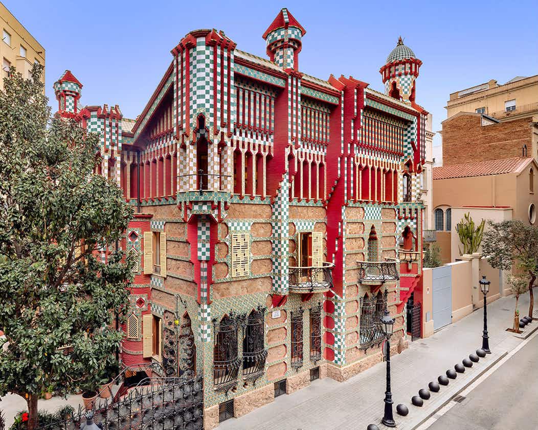
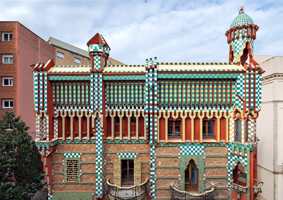
Casa Vicens

Casa Vicens is the first building designed by Antoni Gaudí after graduating in architecture in Barcelona in 1878. It was built between 1883 and 1888 in the Gracia district of Barcelona.

The house has a pronounced orientalist design, a style that Gaudi developed and perfected throughout his career. The Casa Vicens was commissioned by Manuel Vicens i Montaner, owner of a ceramic factory, and was to be the family’s summer residence.

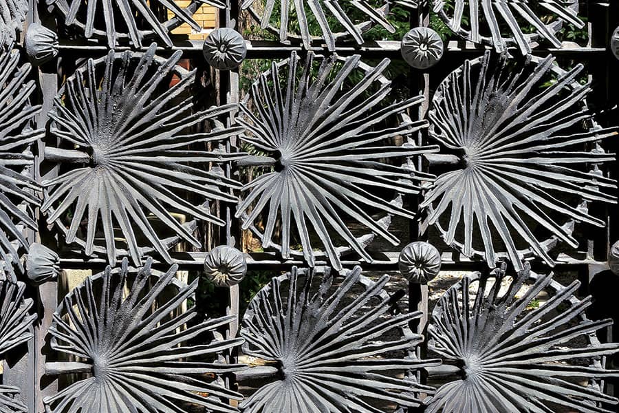
Gaudí designed the interiors of the house together with craftsmen such as the sculptor Llorenç Matamala or the cabinetmaker Eudald Puntí. The iron fence is made from a palm leaf manufactured along with the blacksmith Juan Oñós.

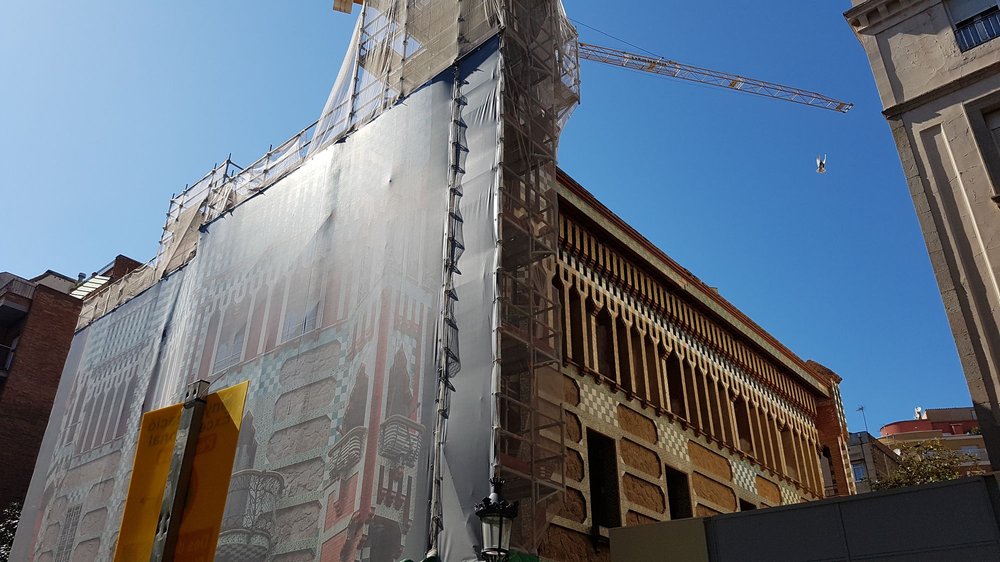
In 2014 the house was sold to a private entity that carried out a complete renovation to turn Casa Vicens into a house to be visited by the public. It currently is part of the tourist route of modernism in Barcelona. The refurbishment was entrusted to the Martínez Lapeña – Elías Torres architectural studio, which was able to reconstruct missing architectural elements from old photographs, as well as eliminate features that were not in Gaudi’s original project.

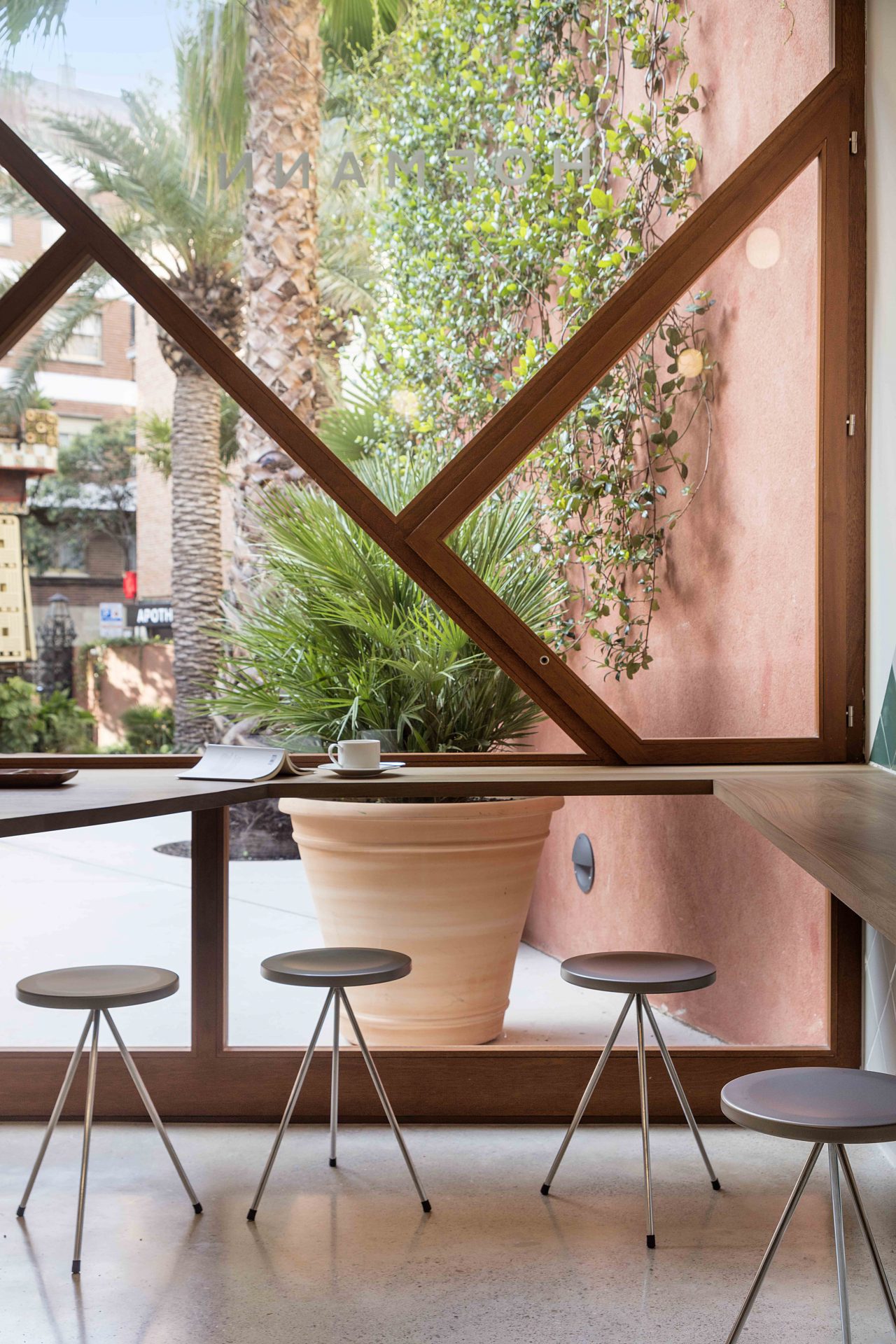
Now a house-museum, Casa Vicens offers its visitors a cafeteria at the end of the garden that allows them to sit comfortably and admire one of the architectural wonders of the city of Barcelona.

This cafeteria is of contemporary design and its architects Martínez Lapeña and Elías Torres were inspired by the colours and shapes of the original house designed by Gaudí. The Nuta stools, designed by Lluís Pau, are part of the furniture of this cafeteria.


Andreu Carulla x Mobles 114

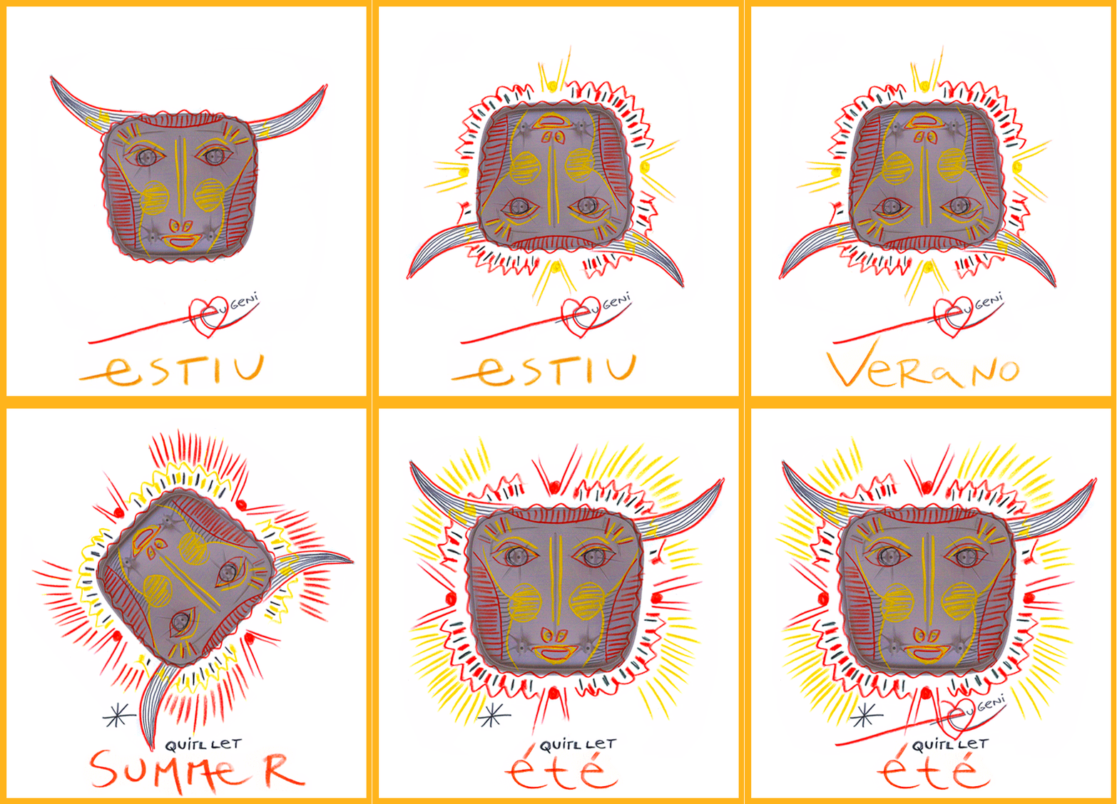
Each summer, Mobles 114 entrusts to an artist, designer, photographer or illustrator to design the artwork of our summer greetings. In 2019, Andreu Carulla collaborated with us.


Carulla supports Mediterranean culture (including the noise of crickets, olive trees, pines by the sea or the smell of rosemary and lavender). A Mediterranean atmosphere made of water and sunshine, with children playing on the beach, that has strongly inspired Andreu in its work.


In everything that Carulla works there is a defense of the near, of the local that becomes universal. An attitude of respects towards nature, traditional craftsmanship, mixed with advanced technology. This proximity also connects with the ideas of primitiveness and intuitiveness.

Children’s games have a great influence on his work. One example is the Wild Ware Jurassic Cutlery inspired by the dinosaurs his child used to play with during lunchtime.


Or the Plat Facetat designed for the Celler de Can Roca that starts from a flat plate that you can transform with your hands to give it multiple shapes. A game, in short.

The projects of the designer all come from a spontaneous background: everything that surrounds him can be of influence. With his imagination, he always ends up transforming its creations into honest and beautiful objects.

Andreu Carulla founded his studio in Banyoles in 2006. His work is based on the recovery of traditional and industrial materials. He is committed to always promote the Mediterranean territory and culture. A contagious enthusiasm makes his projects spontaneous and well thought.

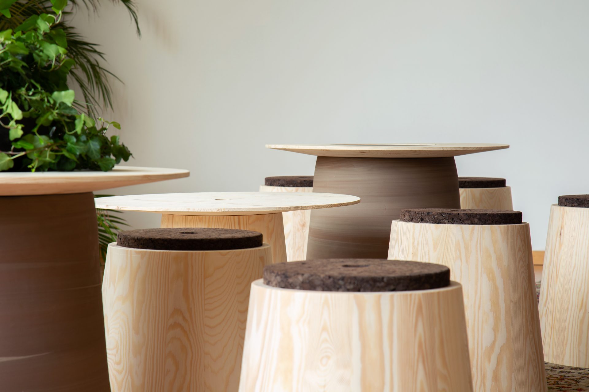
Two years ago, Andreu invited us to collaborate on a furnishing project for the Helsinki Design Week, designed together with Mikko Laakkonen for the residence of the Spanish Embassy in Helsinki. From this collaboration came out a collection of tables and stools made of wood, clay, and cork. Natural materials that belong to both Nordic and Mediterranean tradition.


Salone del Mobile Milano 2019

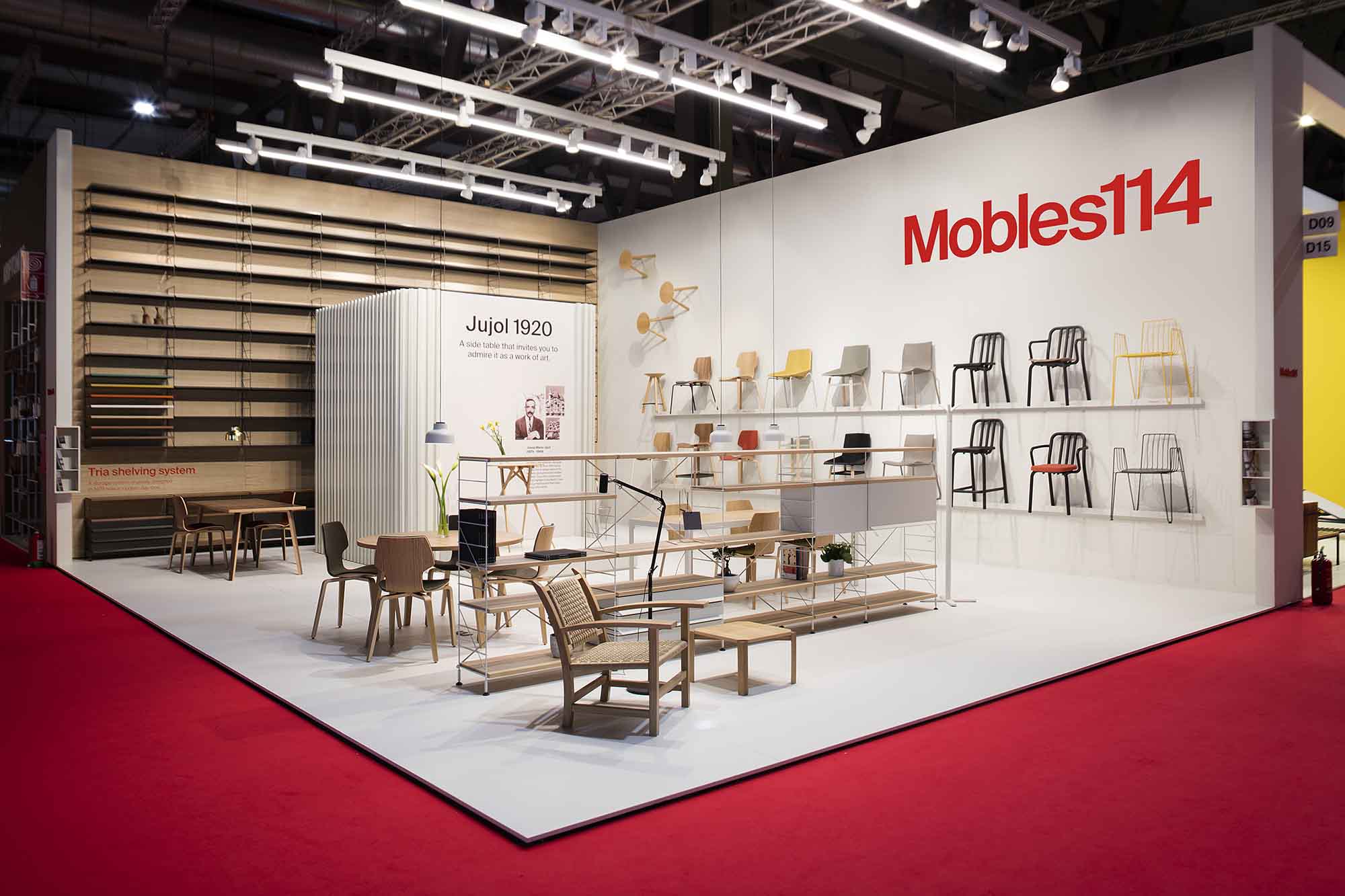
The Salone del Mobile 2019, in the city of Milan, ended on the 14th of April. It was the 31st time Mobles 114 had taken part in this Fair, celebrating its 58th edition in 2019. Without a doubt, the Salone is the most important opportunity in the world to present new products and trends in furniture at an international level.

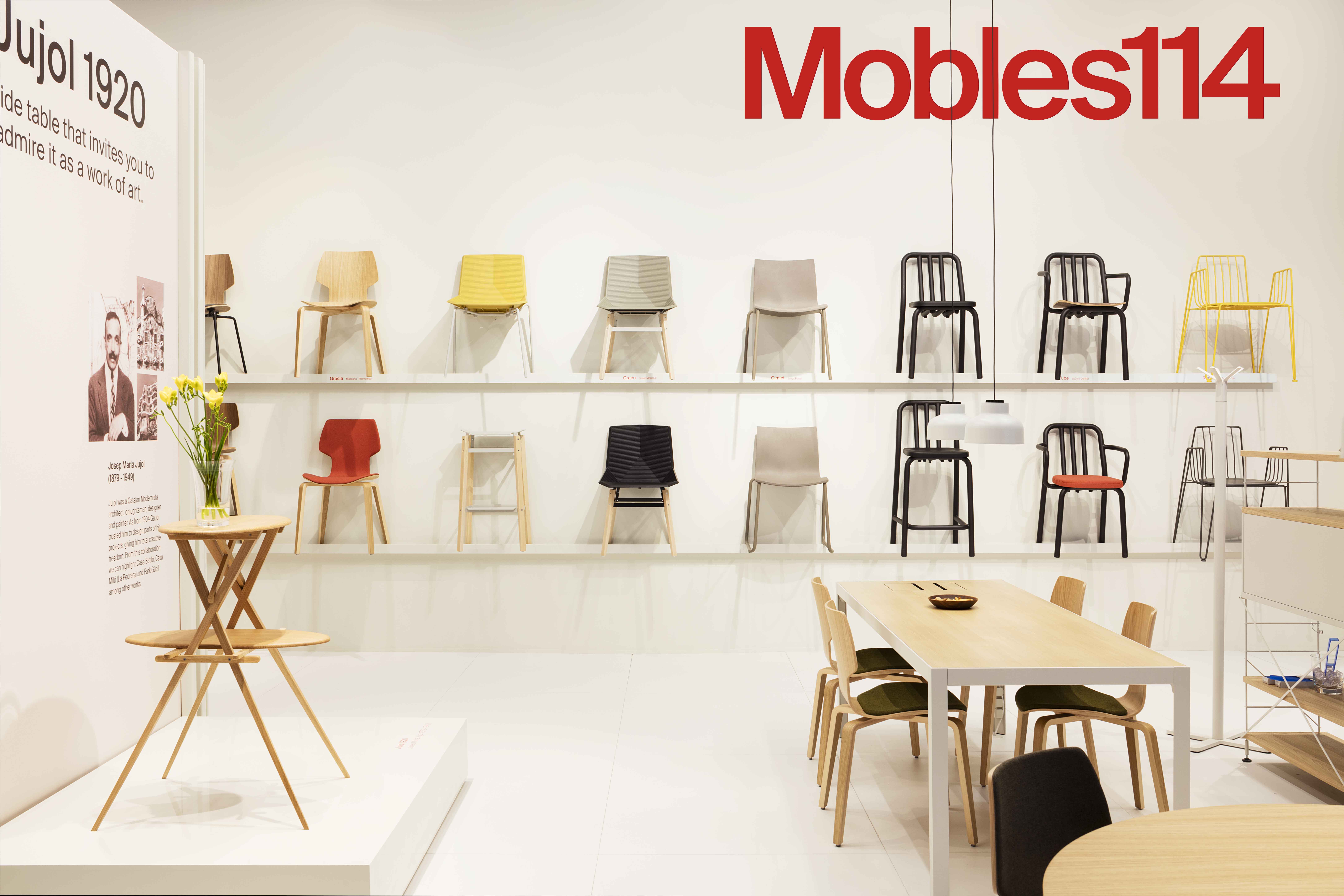
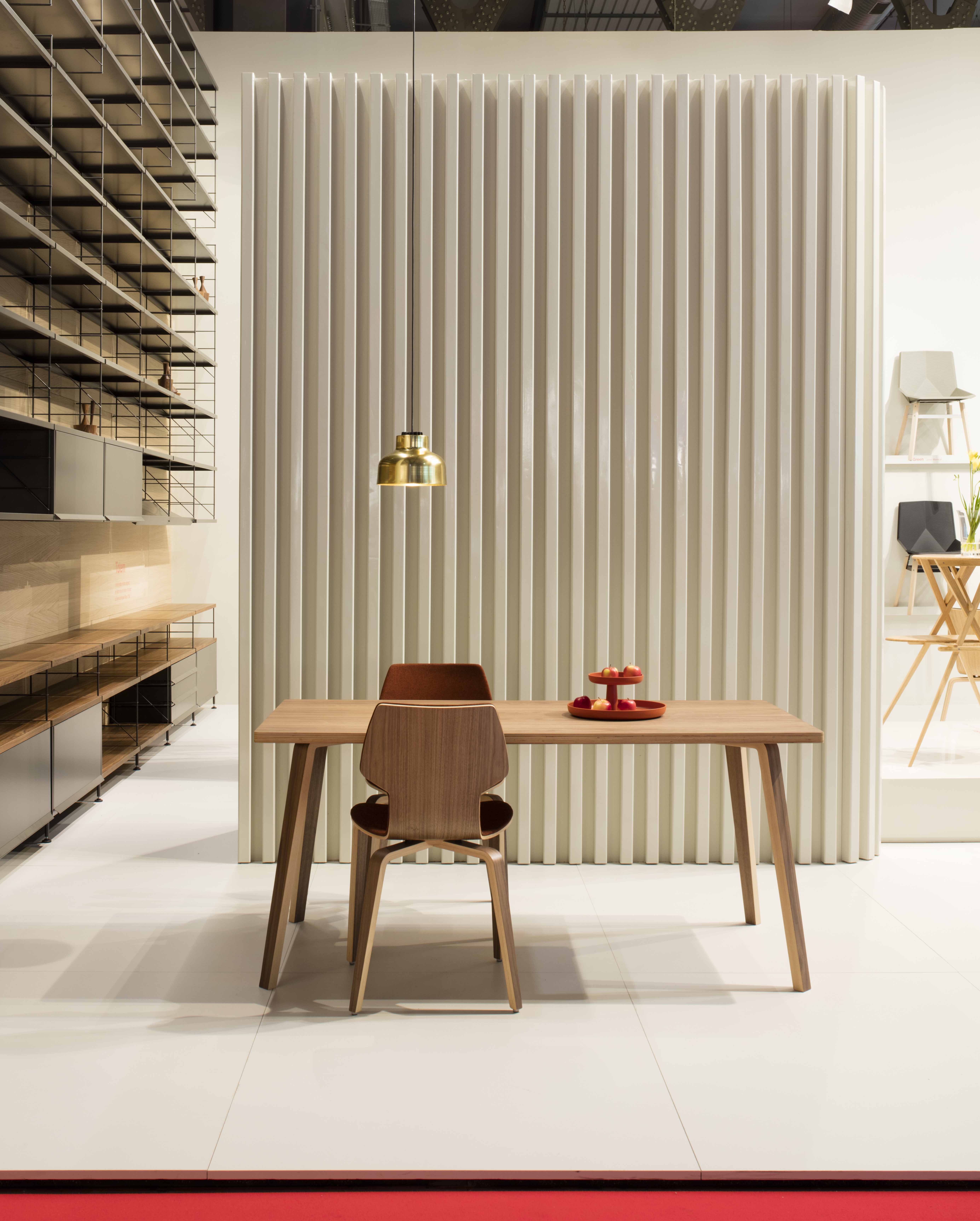
The Mobles 114 stand, designed by Stefano Colli, exhibited the new products launched by Mobles 114 in 2019, extending its catalogue of chairs, tables, accessories and shelving aimed at homes, hotels and restaurants, offices and also public areas.


Colli’s collaboration helped to highlight the brand’s new product structure and convey the new visual identity created by Folch Studio, but the stand’s sober design also served a crucial purpose, using flat white surfaces that contrasted with the warmth of wood to help the product truly express itself.

One of the additions to the 2019 catalogue by Mobles 114 is a new table from the Gràcia family, made from plywood using oak or walnut and available in a wide range of round, square and rectangular sizes ideal for both the home and businesses.


Another new member of the Gràcia family is the upholstered chair in the version with a cushion and cushion-backrest, together with a great variety of fabrics and colours by the Kvadrat and Gabriel brands in their different types of materials.


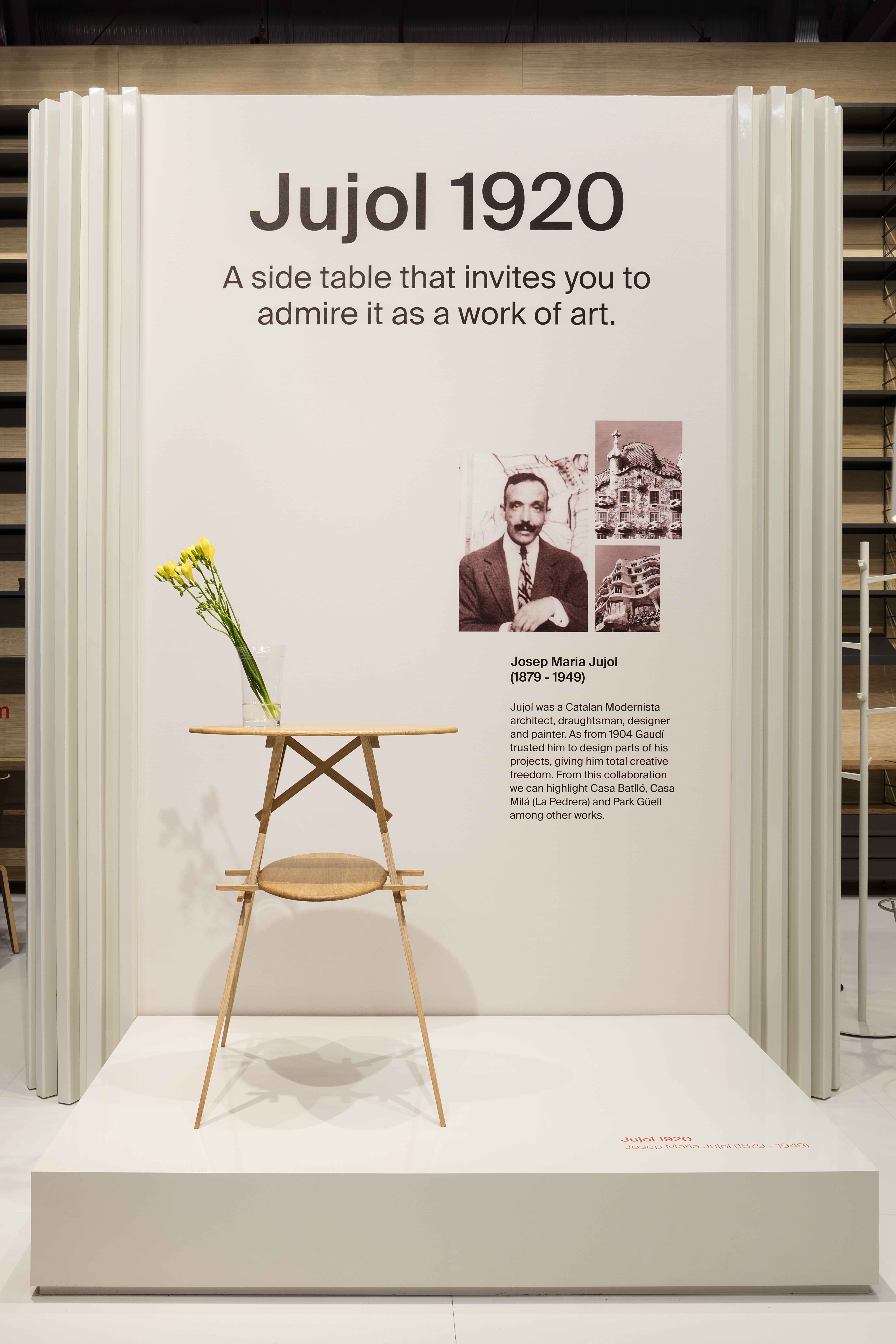
We have expanded the Classic Collection catalog with the Jujol table designed between 1920 and 1927 by the architect Josep Maria Jujol. This is a reproduction of the table exhibited at the MNAC (National Art Museum of Catalonia). It comes from the house where J M Jujol lived, on the Rambla de Catalunya in Barcelona and, given how it was constructed, we can conclude that it’s a prototype, a unique model which we have reproduced and now forms part of the Mobles 114 Classics catalogue.


The stand was able to present the entire collection of seats by Mobles 114 and its designers, displaying the unity of style and timelessness that Mobles 114 always strives for in its collections.


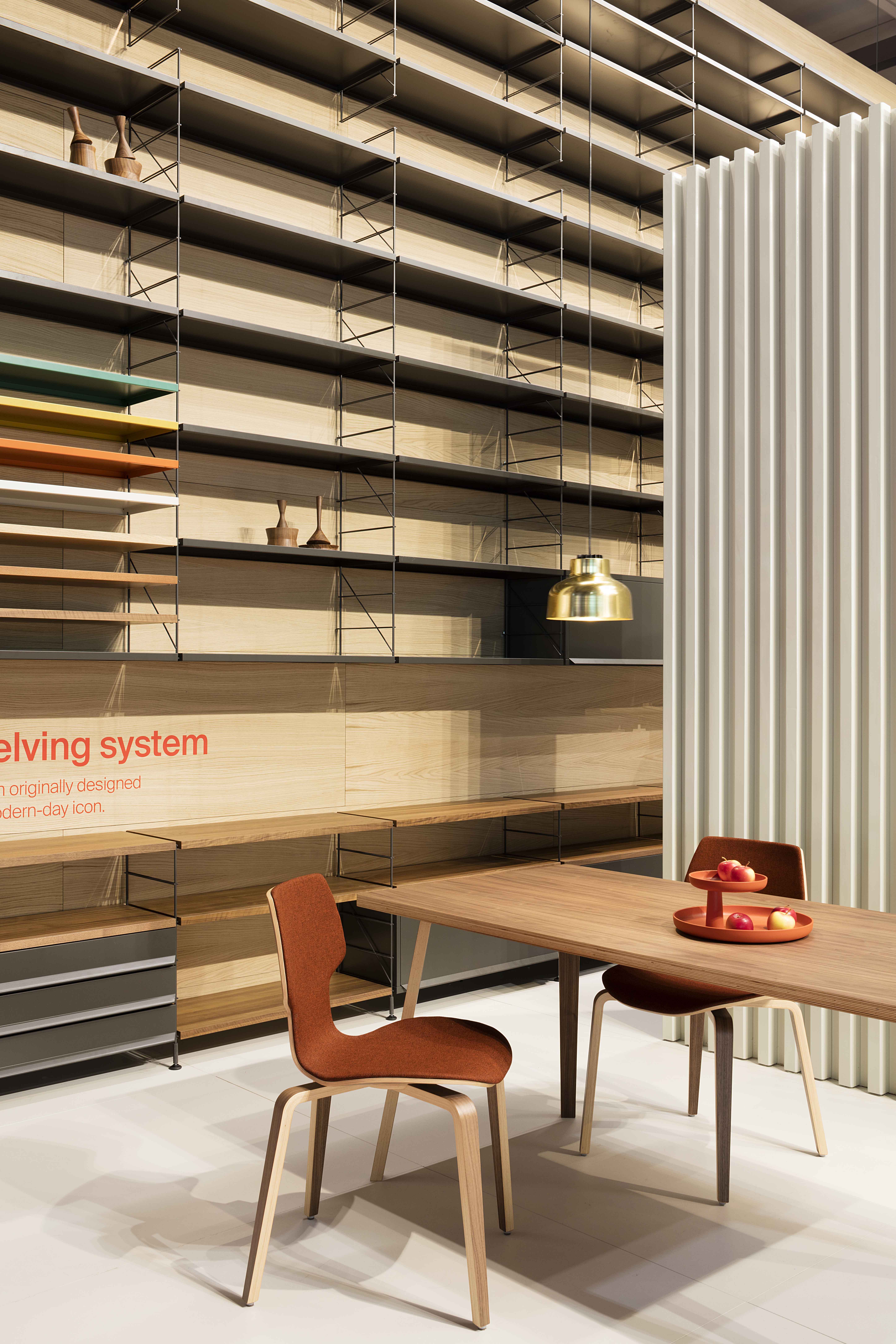
The Tria shelving system was once again the star of the stand, the system’s great capacity and features being demonstrated by a shelf measuring 7.2 metres wide and 4.5 metres high. The latest version of the self-standing Tria shelf also took centre stage at the exhibition. The designer Martín Azúa helped us to decorate the Tria shelving, creating an exquisitely beautiful sculpture.

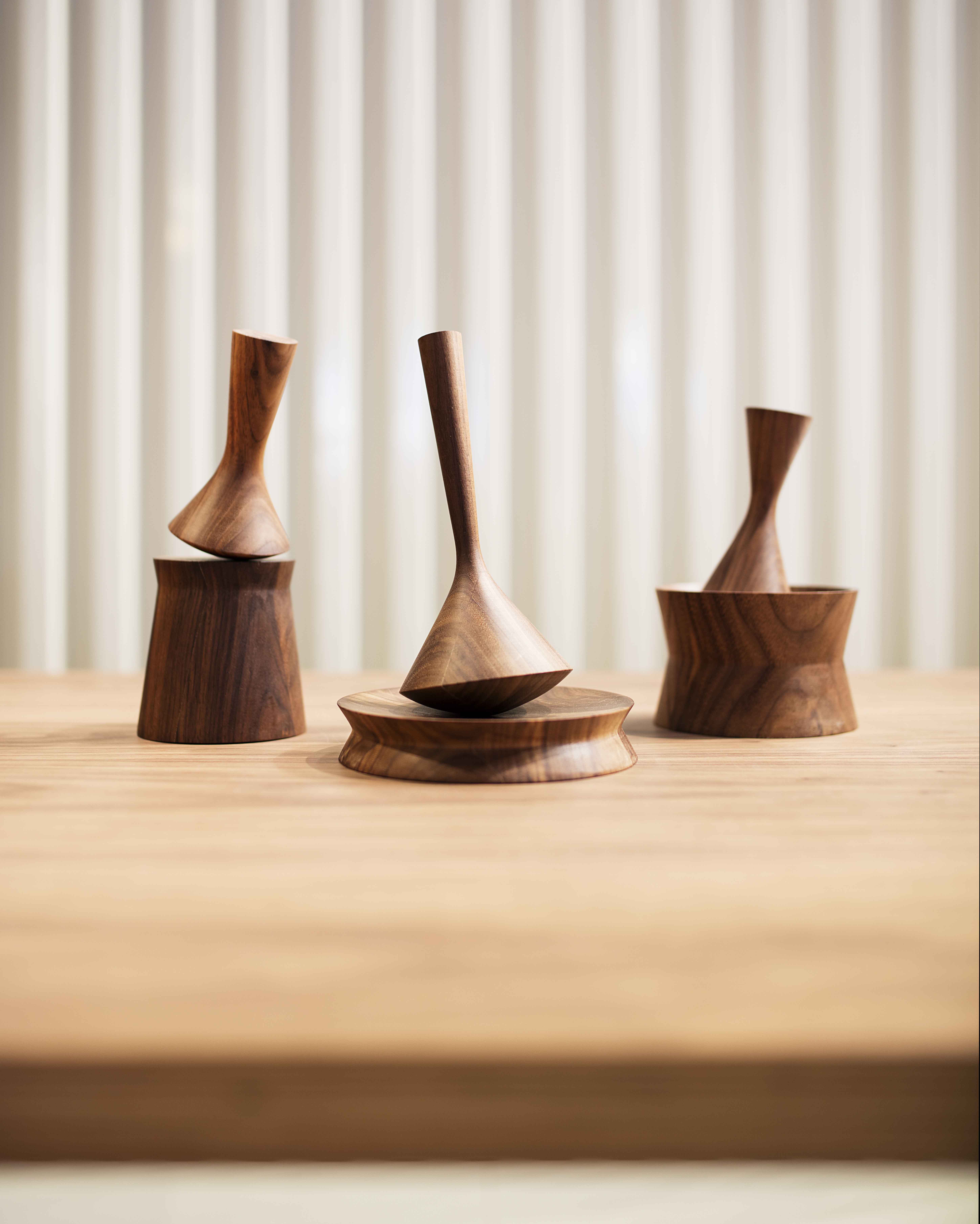
The Totem mortar is a limited edition, a collection made up of three different totem models which have both a decorative and practical function: they can be used as pestles to grind spices, pigments, plants and seeds, among other things.

Many thanks to all those who visited the stand. We look forward to seeing you again next year!


Photographs: Meritxell Arjalaguer


New identity by Folch studio

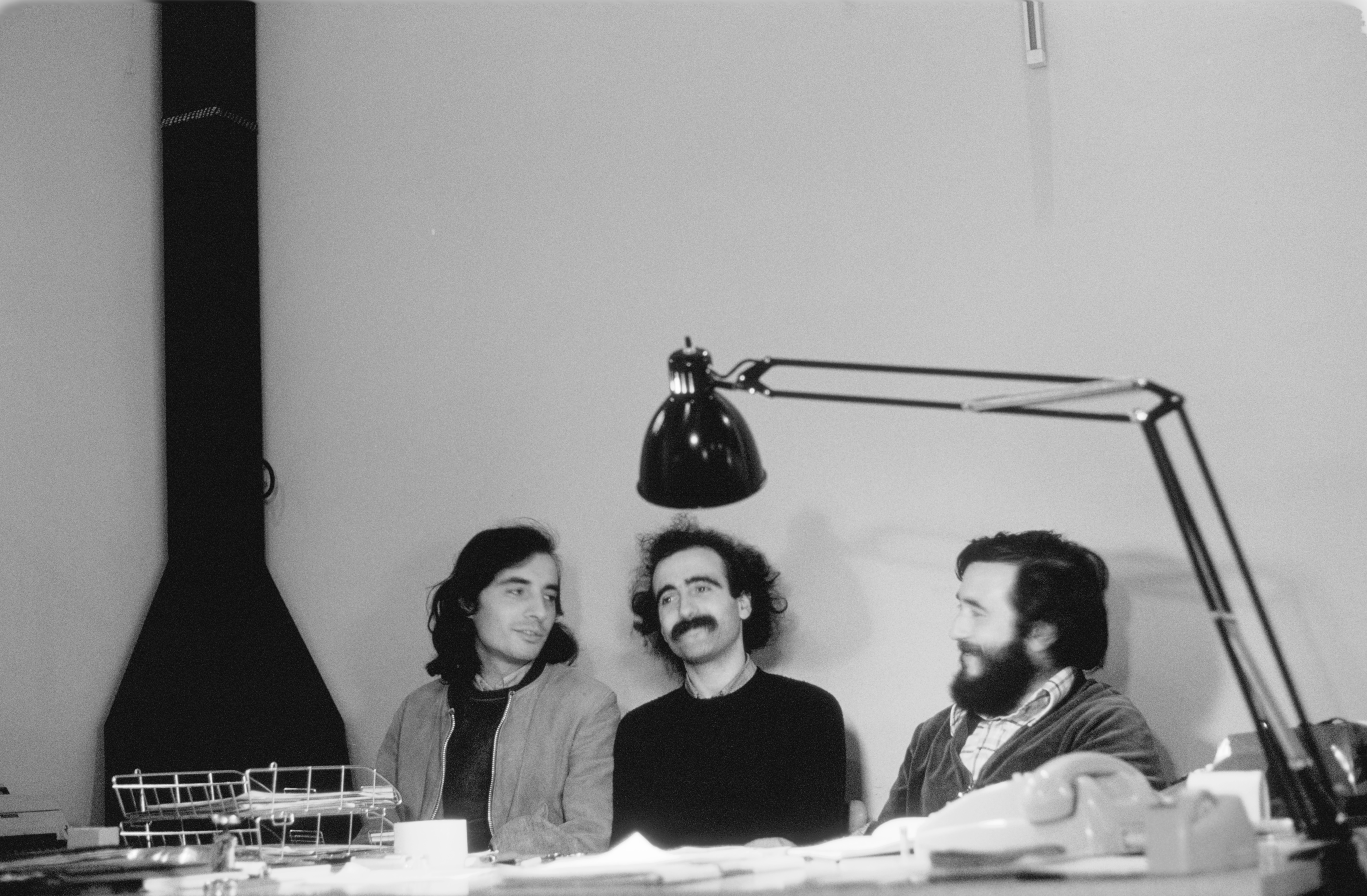
Changes are occurring at an ever-increasing pace and Mobles 114 has realised it needs to define a new visual identity in tune with today’s world while still preserving the values and coherence achieved by the brand over the last 45 years. It all started with Josep Maria Massana, Josep Maria Tremoleda and Mariano Ferrer who founded Mobles 114 back in 1973.

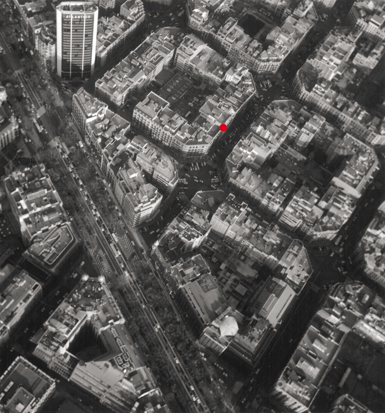
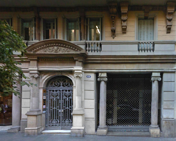
Number 114 in Enric Granados Street, in the Eixample district of Barcelona, was the company’s first home and where its name originally came from. The image of the Eixample, with its orderly blocks of flats arranged into octagonal islands, is identified with the contemporary nature of Barcelona and also with the soul and DNA of Mobles 114.

Foto Manuel Serra


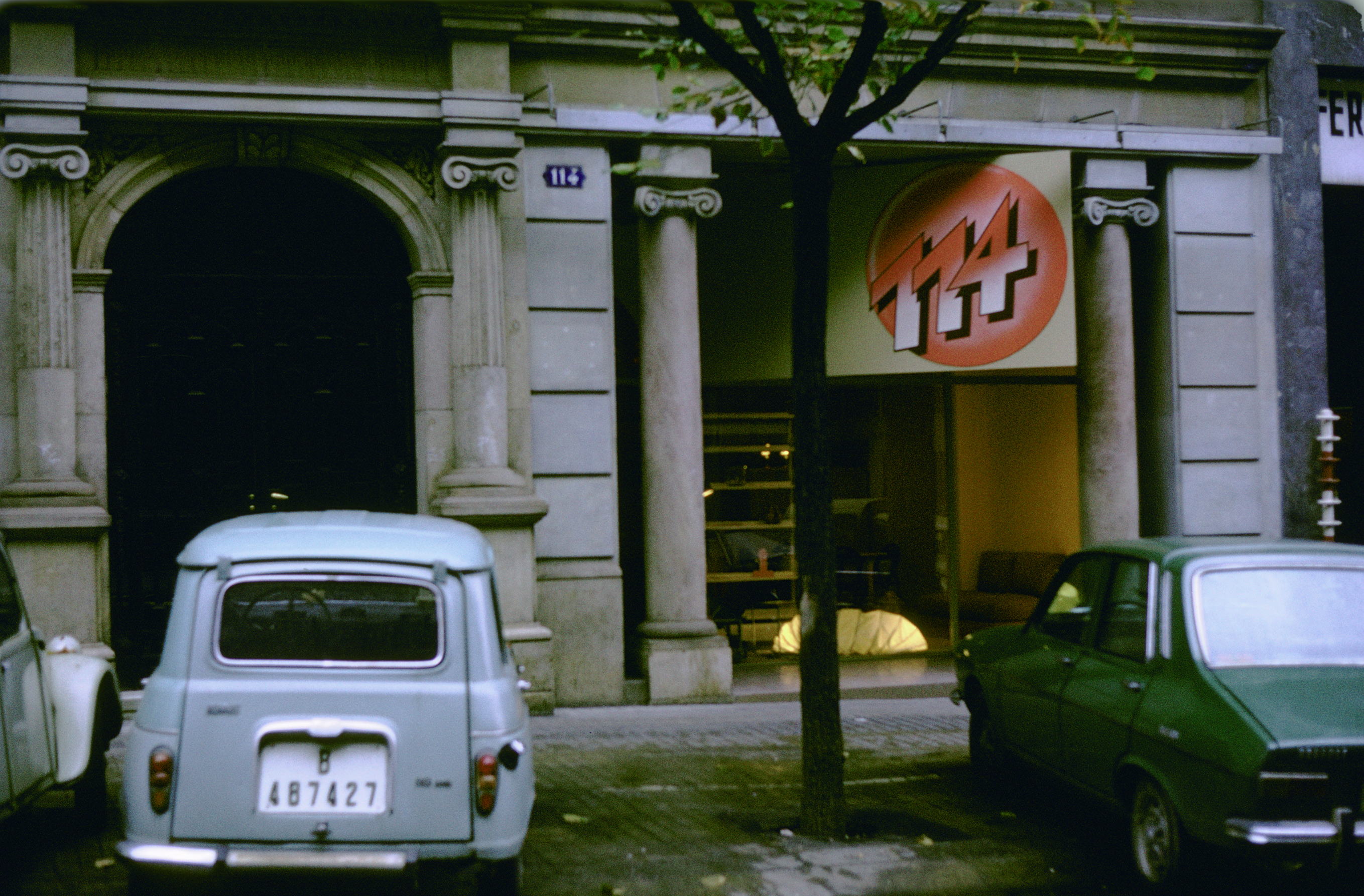
The first logo was designed by América Sánchez and was displayed on the façade during the first few years of the business. A radically modern logo befitting a new generation of designers, architects and artists who were embarking on a groundbreaking venture.

The façade of Mobles 114 at Carrer Enric Granados 114 in 1973.


The logo was redesigned several times by América Sánchez, updating the visual identity and adapting it to the changes occurring throughout the history of Mobles 114. For the last version in 2011, the redesign was carried out together with Helena Tremoleda.

Mobles 114 now needs to define a new visual identity in tune with the times. ‘We also needed to resolve the problem caused by a brand with a logo represented principally by the number “114” which did not coincide with how we want to be recognised: as Mobles114.’


On this occasion Folch Studio has taken over and created a new visual identity at the same time as designing a new logo including the word “mobles” with all its letters, followed by the identity always provided by the number “114”.


Folch’s vision and insight into the values of contemporary classic, a timelessness which Mobles 114 has always defended, are reflected in a new identity that clearly conveys these values.

Pol Montserrat x Mobles 114

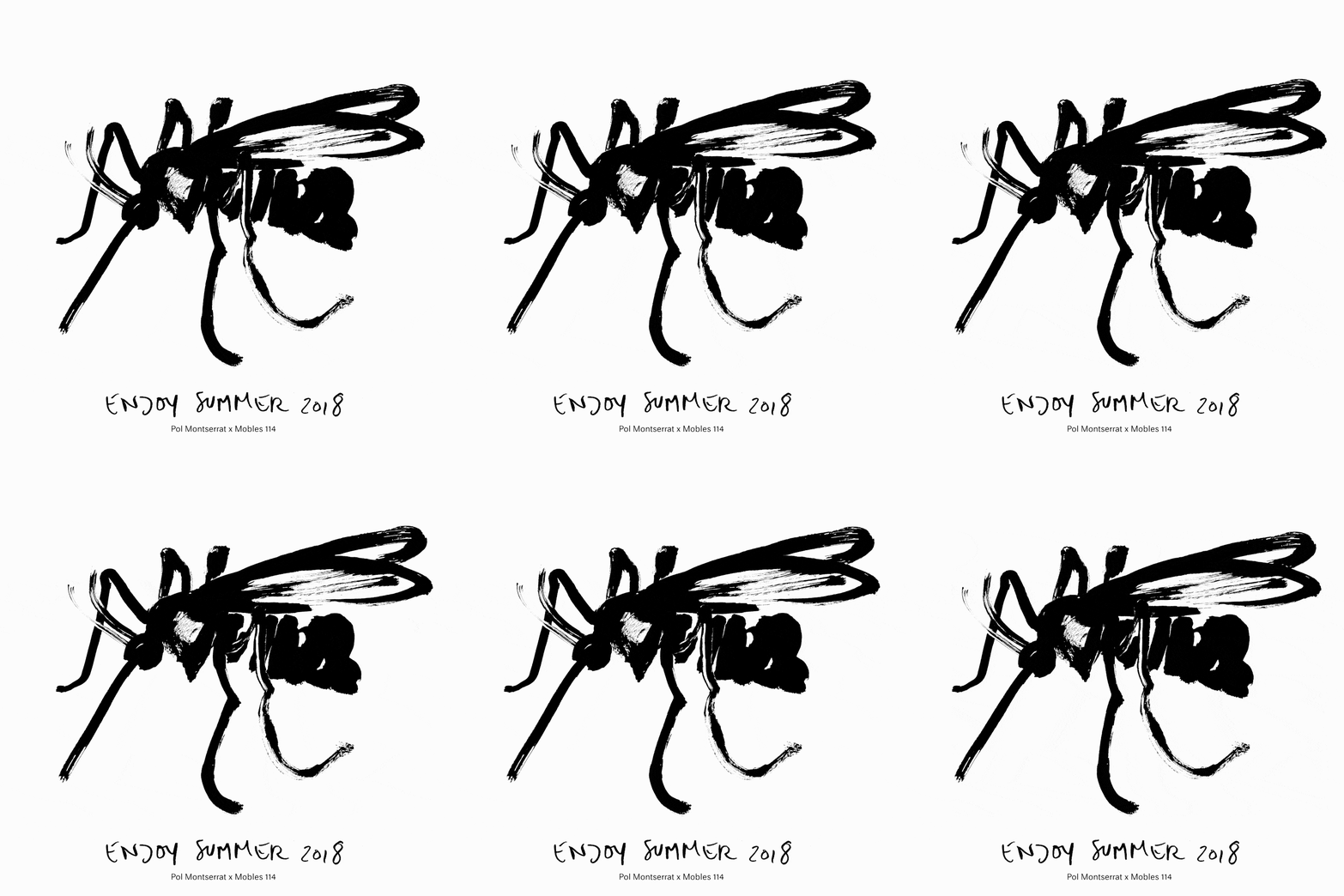
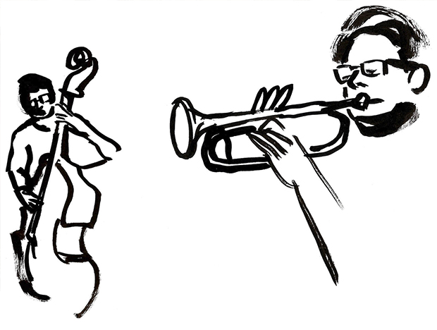
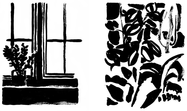
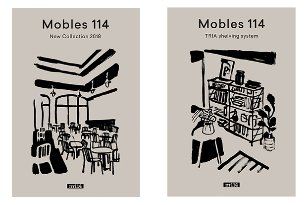
Pol Montserrat decided to devote himself to art after finishing his Graphic Design course at ELISAVA and he soon managed to create his own style and language. Simple shapes created with just a few lines or a patch of colour in Chinese ink on paper, deftly combining different styles but without losing the essence of the piece.


Pol’s work can be seen in Eldorado and Odiseo by Folch Studio, in the Marset lighting catalogues and also at the Hotel El Palauet in Barcelona. For Pol “the key to success is a commitment to projects that goes beyond budgets and clients”.

This year, Mobles 114 has asked Pol to create the illustrations for the two covers of its 2018 Novelties Catalogue, as well as the illustrations for the walls of our stand at the 2018 Milan Trade Fair.

Happy 2018. Mobles 114 and Marc Morro

For the New Year greetings by Mobles 114, this year we have counted on Marc Morro. This designer -“mueblista”, as he defines himself- pays homage to one of the most iconic pieces of the Classics catalog: Copenhaguen ashtray, by André Ricard.

Marc and his furnishing company, AOO, are passionate for routine and the beauty of hte little things. Little things like this minimalist design, free from adornments chosen for the occasion. In a reinterpretation which adds a surprising new use to the ashtray, signed by Ricard in 1966.

Made in a single block, this ashtray is the result of a geometric design that uses the simple repetition of a cylinder. A recipient made up of an open cylinder with another, smaller cylinder inside to support or extinguish cigarettes; the shape of the groove in the outer wall matches the rest of the ashtray and is perfectly designed to hold a cigarette. This is a hardwearing, stackable ashtray that fulfils its function with the utmost effectiveness.

This design classic is in line with the goal of Mobles 114 which, for more than 20 years, has remained in the market to preserve our country’s heritage in terms of both culture and design.

In this case, Morro has made an analogic photography of Copenhaguen, in its new use as candle holder.

Happy new year 2018!

Mobles 114 in Milano: Fuorisalone

Milano is the capital city of design every April. Salone del Mobile capitalizes all the news about furniture. But further from the fair, you can breathe creativity in every corner. Let’s take a walk in Fuorisalone by Mobles 114.

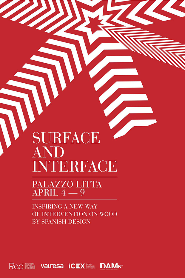
Surface&Interface at Palazzo Litta

Historic palace was the biggest contrast at the exhibition A matter of perception, organised by Damn Magazine. A social point and network where Linking minds, where you can find Surface&Interface. An exhibit curated by RED AEDE in collaboration with Valresa and the support of ICEX, España  Exportación  e  Inversiones.

surface-interface-mobles114

New technology Virtual Melt by Valresa allowed the REDmembers to collaborate with designers, illustrators and visual artists to personalize some of their furniture pieces.

fuorisalone-milano-2017-valresa-mobles114

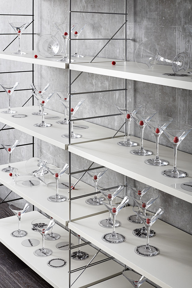
Bendita Gloria studio created an illusory scenario where technology interacted with TRIA by Mobles 114 placing fictitious coasters which question our perception and help us to be tidier. A beautiful way to place the glasses.

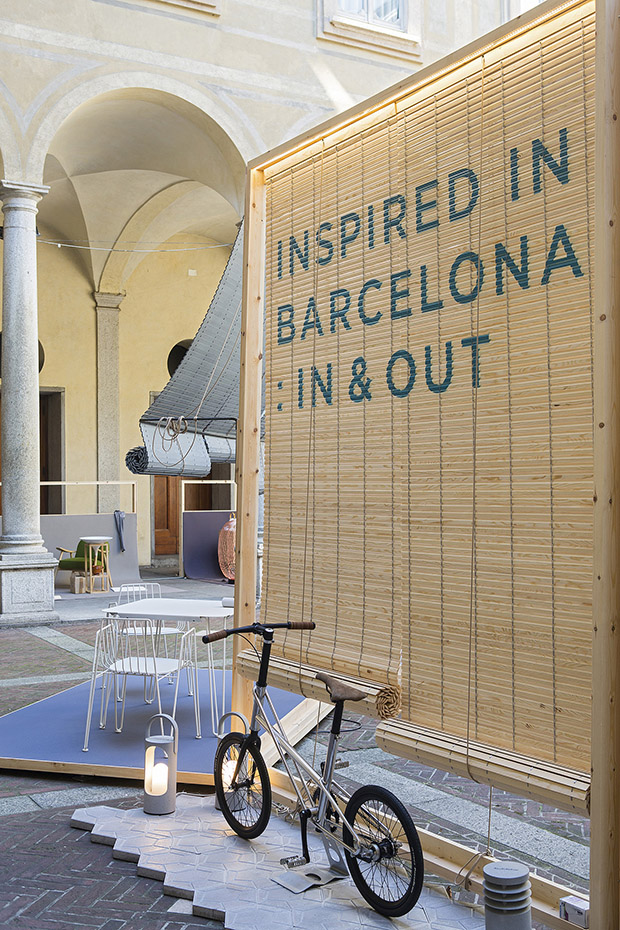
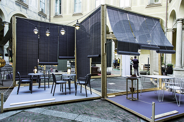
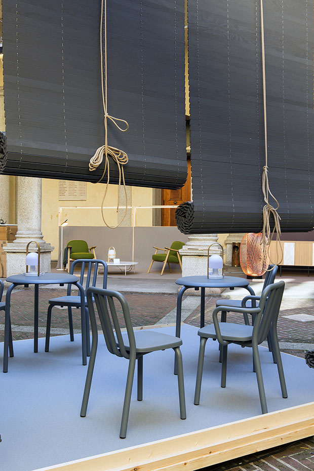
Inspired in Barcelona: IN&OUT

Another wonderful building, Palazzo Isimbardi, was home for the exhibition organised by  ACCIÓ (Generalitat de Catalunya) and BCD Barcelona Centro de Diseño.

inspired-in-barcelona-inout-milano-2017-fuorisalone-mobles114

inspired-in-barcelona-inout-milano-2017-fuorisalone-mobles114-2

Inspired in Barcelona: In & Out‘ showed Barcelona as an open city, an invitation to live outside and enjoy the creative and cultural Mediterranean flair.

inspired-in-barcelona-inout-milano-2017-fuorisalone-mobles114-3

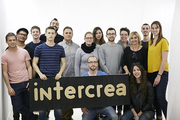
Intercrea UJI, at Instituto Cervantes

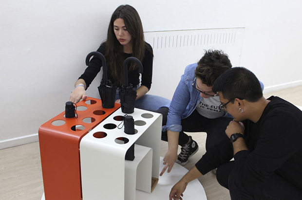
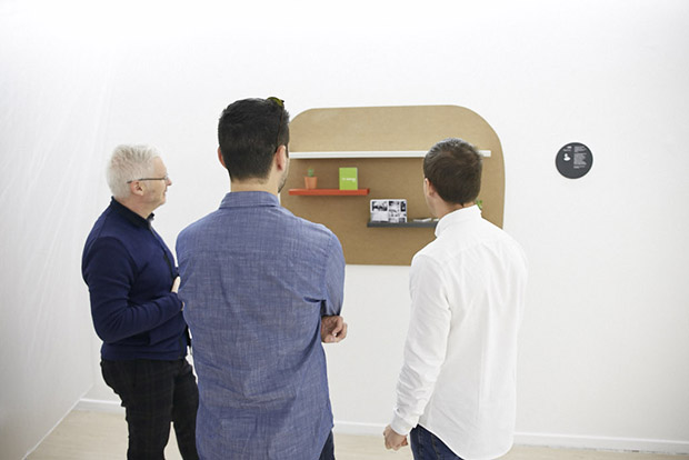
Interaction and creative synergy at this project by Universitat Jaume I and Clausell Studio with design students of “Grado en Ingeniería en Diseño Industrial y Desarrollo de Productos”.

intercrea-uji-fuorisalone-milano-2017-mobles114

Michael Alexander, Judit Andreu, Vicent Blai, Carlos Joaquín, Joan Martí, Miguel Oury, Alba Puerta, Borja Sánchez, Paula Usó, Núria Vernís and Francisco Viciano presented Line shelve, Obbo umbrella stand, Octa and Ona bins and Ric charging totem; all of them developed thanks to a collaboration with Mobles 114.

intercrea-uji-fuorisalone-milano-2017-mobles114-2 intercrea-uji-fuorisalone-milano-2017-mobles114-3

Escuela Técnica Superior de Arquitectura, Granada

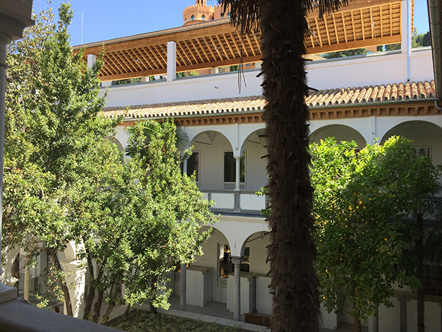
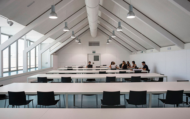
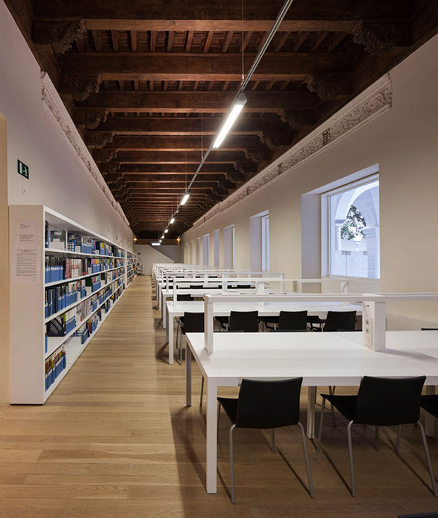
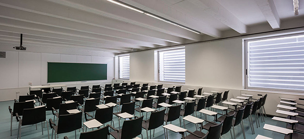
Former Militar Hospital of Granada (Andalucia, Spain) has been transformed by architect Víctor López Cotelo into the new headquarters of the University of Architecture. A brilliant project, where respect of the old building has been connected to the comfort and practicity needed to teach and study.

2 escuela arquitectura granada

Old and ‘isolated’ modules from the ancient Hospital have been integrated in one functional unity, so as to create a modern educational center that also maintains the vernacular architecture. “A place to teach architecture in class but also by the building process”. It is a symbol of the neighbourhood and the city, where future architects will count on impressive facilities.

3 escuela arquitectura granada

Accessibility, acoustic isolation adapted, structural conservancy. Everything has been well treated. White and wood prevail. Historic spaces have been restored, for instance the chapel will be a bookshop, and library and director office will be professors’ hall.

4 escuela arquitectura granada

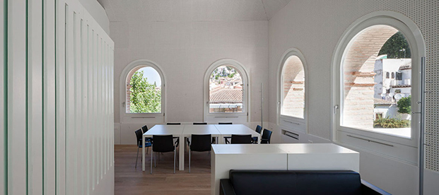
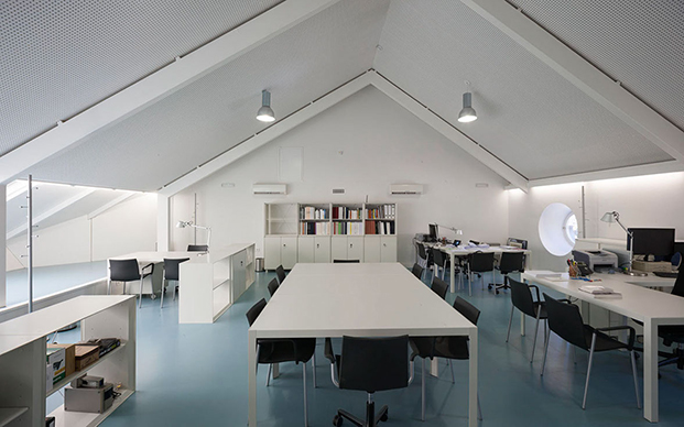
Mobles 114 has participated on the project furnishing classes and spaces with different Gimlet seating designed by Jorge Pensi, Pey tables and Mirac coat stands.

5 escuela arquitectura granada 6 escuela arquitectura granada


7 escuela arquitectura granada

Photography: Fernando Alda

114: the story of a number

Brand Mobles 114, founded by JM Massana, JM Tremoleda and M Ferrer in 1973, had its first headquarters at 114, Enric Granados street in Barcelona.

The origins of the name are very obvious indeed. Number 114 was part of the first logo, designed by América Sánchez, and was present at the street facade for the first years.

Microsoft Word - enric granados

Logotype has been designed four times: years 1974, 1990 and 1998 by América Sánchez, and for the last time in 2011.

3 logos

For the last revision the company opted for a change of the corporate image, designed once again by América Sánchez with the collaboration of Helena Tremoleda.

logo m114

We would like to invite you to send us pictures of numbers 114 at the street, from the bus, wherever you found them; tag #m114 and #mobles114 on our social networks Facebook, Twitter and Instagram. Numbers define us.

Martín Azúa and his ideas about design

(… coming from the first part)

Knowing the “why” and “how” questions are essential in any creative process, what motivates you more when tackling your work?
I try not to have preconceived ideas and I am among the designers who are distracted by the process. I change a lot my opinion and sometimes target. Maybe it’s a defect, I do not know. In any case, I like to keep some creative uncertainty.
2 entrevista azua II

It seems that we live in a new paradigm dominated by social changes, a revision of values and technological advances. In this changing and sometimes confusing scenario, what do you think the role of the designer should be?

I’m not dogmatic, I think there are many valid points. Right now I am very interested in working with local resources and claim a physical and technological diversity which obviously comes as new without losing the traditional. I don’t like the idea of a standardized world where products are designed and produced by machines and are made of materials that we don’t recognize.

3 entrevista azua II

On occasion you said that design is a tool to make things better, not whimsical or bizarre. If design is an adaptation strategy, what is it about? And is the beautification part of that strategy?
The focus of design needs not be the design. Design is only the strategy it is just the tool. The adjective “designer” puts us in a situation where we forget the essential and get distracted by the superfluous. Of course beauty counts, but it is a beauty that includes ethical aspects, that somehow represents our desire to be better.

4 entrevista azua II

“Having it all without hardly having anything”, could you develop this statement of yours?
I don’t know what pushes us to keep more than the necessary. Having many things sometimes limits us. The free people really don’t have a dependency property. I know it’s a contradiction to be designer. But then, if we depend on something that’s worth something.
What is the space that you mostly like about a home? And with what object you can not imagine a typical day?
My favorite space has to do with light and changes throughout the day. When I shower in the morning direct sunlight comes in the bathroom and it’s great. When I eat at noon the sun comes in again and I think that light feeds me more than food. It is something fantastic about Barcelona. I think the second question refers to a special object that has an everyday but exceptional use. I designed some for an exhibition, “Artjects” which can be viewed on my website, and we saw also at the blog.

Martín Azúa: beauty, nature and ethics.

The natural cycle of life, the evolution of objects or the relationships between man and his environment are aspects that Martin Azua stresses in his designs. A starting point determined in part by his origins. “In the Basque Country I think we have a special relationship with our landscape. In my case with a particular place: a beech forest in the mountains of Opakua, Álava (Spain). When I walk in the woods I feel good, everything that happens around me makes sense. In Barcelona, nostalgia makes me miss all this and I reflect this feeling on some of my projects.”

2 martin azua salero

Do your designs aspire to reproduce natural processes? Or do you prefer to re-think and explore an imaginary world?

I think we have much to learn from nature, it embodies a basic principle of economy where nothing exists for the sake of itself. Even the seemingly most capricious of flowers has a very specific function. I would like my designs to help to become aware of our belonging to a natural environment. When you’re a kid, imagination takes you to new places; with age imagination leave the way to memories.

Looking at your Luco stool, what aspects of its design are of a universally intelligible language and what other of an individual, more local language?

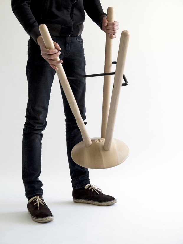
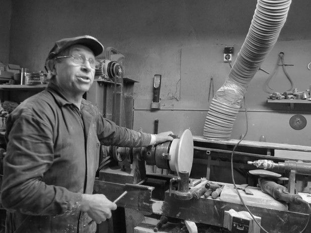
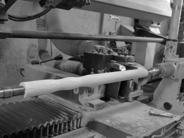
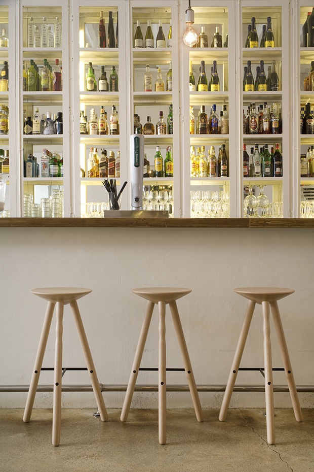
In their basic essence, objects of all cultures are similar but there are subtle differences that highlight an incredible diversity of responses to a same problem. The three-legged stool is basic and stable. Luco retains this primary idea but adds very contemporary aspects. Its manufacture involves a craftsman lathe and a CNC workshop. I think that’s what makes it special. Memory has been an essential ingredient in this project.

3 martin azua


To cherish the value of an object begins from appreciating the material used?

Yes, the material conveys much. Unfortunately some industrial processes remove features that often add value, but in the case of Luco, beech wood is clear and delicate, it has very subtle veins that stand out with the turning process and we protected the wood with a varnish that respects the silky touch of wood.

Your relationship with M114 goes back to 2006 and to the collections of chairs and stools Om and Flod, currently available in the catalog M114. How would you summarize your professional relationship with Mobles114?

It is a relationship between designers. I respect the work that JM Tremoleda and JM Masana have made over time in Mobles114. They have always had a very functional line. Their products include a discrete and somewhat timeless beauty. When talking to them there is no room for whim, the arguments are very important. I like working with them: they have clear ideas and are very demanding.

Happy 2015 by mobles 114

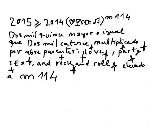
A formula by Martí Guixé has been the way of sending best wishes for the new year by mobles 114:

A possible translation of the formula could be:

“2015 is bigger or equal to 2014 multiplied by, brackets, ideas by rauxa (outburst) divided by seny (sanity), raised to mobles114″.

The ex-designer proposed some different ways to express the happy new year wishes, using its particular and original methods, as can be seen next:

mobles 114 talkings: luxury and design, by Massana and Tremoleda

On the occasion of World Industrial Design Day last 29th June, mobles 114 wanted to talk about design. The founders and designers of the company, JM Massana & JM Tremoleda, started a conversation around two key words: luxury, and its relationship with design.

How would you describe design, by mobles 114?

Design is a methodology incorporated into production processes that adds value and quality to the product, solves functional requirements and conflicts for the user and follows the company’s strategic guidelines.

We understand that the designer, working closely with the company, coordinates all the elements involved in creating a product, proposing technical and productive solutions paying attention to innovation and environmental responsibility; also brings functional improvements and defines taking good care of the resulting shape to identify the product with its meaning.

What is the main style valued and considered in mobles 114?

We don’t consider ourselves within a particular style, but we actually qualify proper values of the product identified by the brand m114, such as search for optimal value, a quality produced product and suitability for markets to be targeted and competitiveness goals, in addition to consistency with other collections that make up the 114 mobles catalog.

How do you define luxury, in terms of design?

Luxury is associated with exclusivity and high economic value. These two terms are terms which can be incorporated into a product briefing defined by the interests of the company to be transformed by Design to become a quality derived from some materials, manufacturing processes and branding association, usually very powerful and with associated value.

In fact, design would reinvent luxury thanks to innovation, bringing it away from mimetic and decadent styles. Innovation understood as an improvement towards rather complex processes, or either semi-artisan, and exclusive materials. Creativity can also bring renovation to luxury sector, renewing the product image and increasing the differentiation between exclusive brands.

What do you think is the added value of luxury in an interior?

Currently, luxury in an interior design is identified with distinction, ostentation above the required quality, wealth, and even some baroque. Therefore we think that is part of a conservative, affluent wave. But an interior can also show the exclusive quality related to luxury, with a quality product selection, in an environment with a desire to create new sensations, innovative, comfortable, human and in keeping with a contemporary interior.